American Express
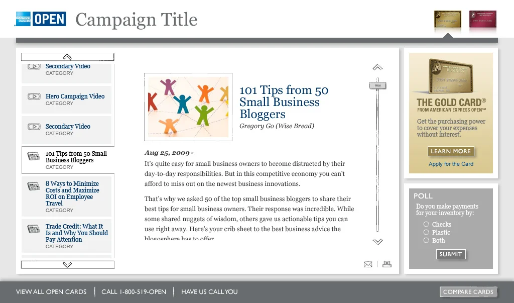
When I started working on the American Express website in 1999 it was a collection of business unit micro-sites, independently branded and loosely held together by a global navigation. Nearly all the content was duplicated art and copy taken directly from brochures and take-ones. At the time, file-size limits, page weight restrictions and security concerns kept the site from being relevant or useful to cardholders. It took six years of client relationship building to change policies, loosen technology restrictions and bring the site together under a cohesive visual design. In 2005 when I took over as Creative Director, we used traffic and spend data to show where to focus resources and strengthen the purpose of the site; customer service.
This research and analysis showed that AXP's best customers had online accounts. They checked and managed those accounts regularly. Understanding the causal relationship, we worked to redesign both on and offline messaging and marketing to encourage online registration. With a user-centered approach we redesigned and optimized the most important touch-points on the site: the home page, the entire account management section of the site and the card acquisition and application area. This led to huge cost savings and increasing Cardmember spend and tenure. After the redesign we saw a 400% increase in prospect conversions, 85% increase in Cardmember conversions and by the 3rd generation launch +60% increase in cards acquired online.


